Portfolio design
- Period
- 2026
- Contribution
- Design and development
- Status
- Public source; local review implementation

A common frame for projects that need different ways of being explored.
My work brings together browser tools, photography archives, backend workflows and interactive 3D scenes. A screenshot can introduce an archive, but cannot show how a graph responds to dragging or how a browser tool changes a listing. I built the portfolio around three paths: scan the work, open a focused preview, or read the decisions behind it. Some projects need an article rather than another card.
Giving the projects a common frame
The surrounding interface stays monochrome, with thin rules, square media frames and compact labels. Photographs and project interfaces supply the colour. A restrained photography archive and a reactive scene can share that setting without adopting the same visual identity.
Typography provides the hierarchy: large display text introduces the collection, while a quieter reading measure holds descriptions, navigation and articles. Light and dark themes share semantic canvas, ink and muted-text roles rather than changing the structure of a page.
Moving from an overview to a project
On desktop, moving rails introduce the visual projects. Selecting one opens its preview, description and links, with neighbouring work remaining visible. The focus state has a URL hash so it can be shared and restored through browser navigation. Arrow keys change projects; Escape closes the view and returns focus to the control that opened it.
Small screens use an expandable list instead of shrinking the desktop rails. The TVM bot and Bot or Not remain directly linked write-ups: their engineering explanations do not require a simulated visual experience. Both the browsing collection and article list draw their identity and links from one catalogue.
Projects
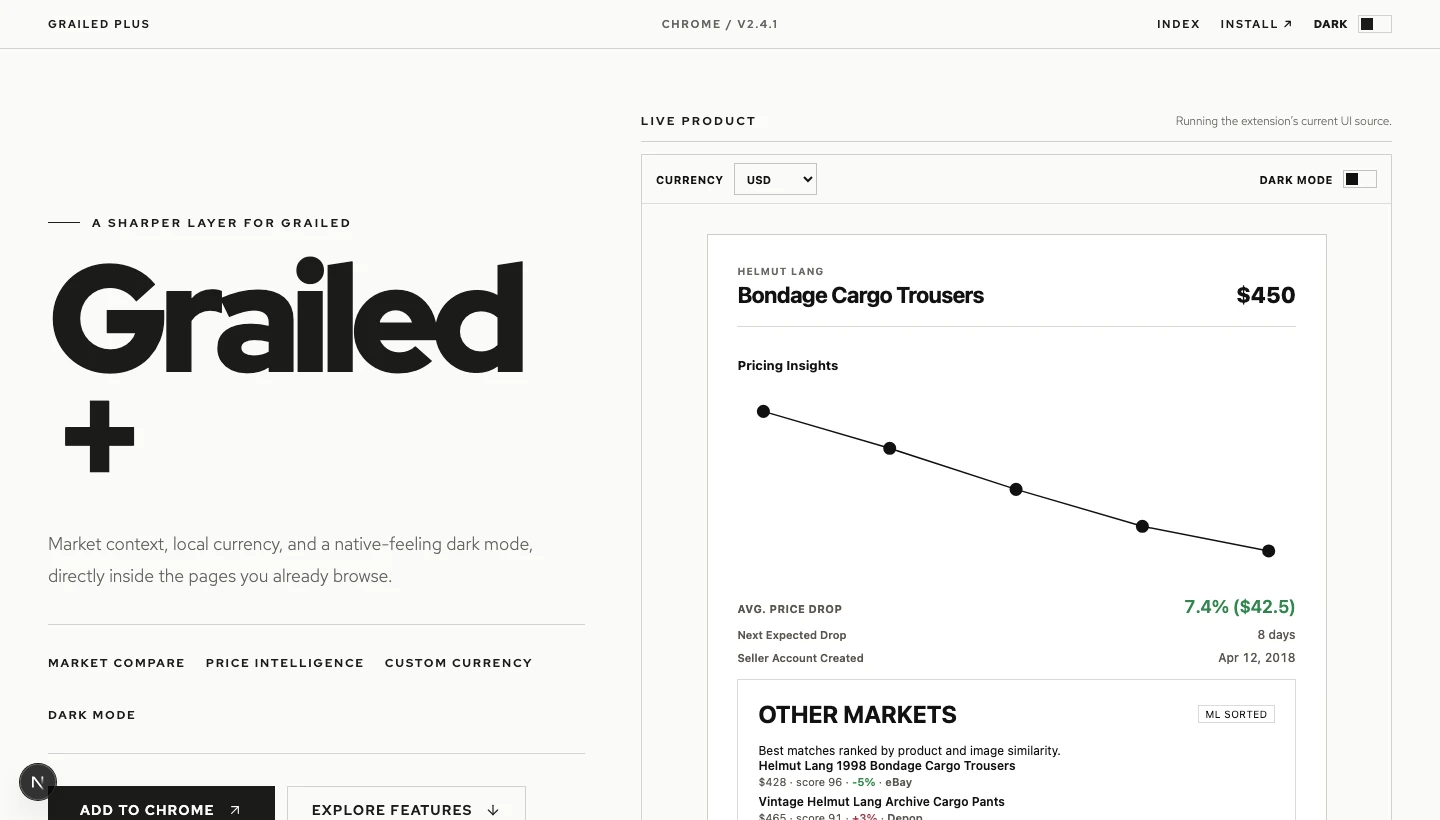
TypeScript · ONNX Runtime · Node.js
Cross-market comparison, price context, local currency, seller metadata, and dark mode inside Grailed.
Making room to read
The articles use MDX and shared components for figures, galleries, contribution details and comparisons. Text and media share a column capped at 672 pixels, with smaller-screen gutters. An article does not depend on successfully operating its preview: prose, figures and direct links remain available independently.
That separation also gives failures a useful boundary. A blocked embedded site keeps a single open-directly icon available without hiding the explanation. It remains available even when the browser cannot report a useful cross-origin frame error; there is no reload control or options panel to work through.
Keeping movement and navigation accountable
Keyboard focus stops the desktop rail, while reduced-motion preferences disable automatic movement. The focus view retains preview instances across selection changes; hidden and inert do not mean that all rendering or networking stops. I do not claim a performance gain from that lifecycle without measuring it.
The keyboard regressions in
tests/e2e/portfolio.spec.ts
exercise focus restoration and history. Navigation and preview-failure scenarios
have separate browser tests, with intercepted external services. Native pointer
lock stays a headed-browser check; Linux CI supplies a virtual display rather
than removing that capability assertion.
These are implementation provisions and bounded local Chromium checks, not a complete screen-reader, Safari or physical-device assessment. The result is a consistent reading frame with several ways into the work. The next useful feedback is whether an unfamiliar reader can find a relevant contribution and follow it into evidence—not an invented engagement or recruitment statistic.